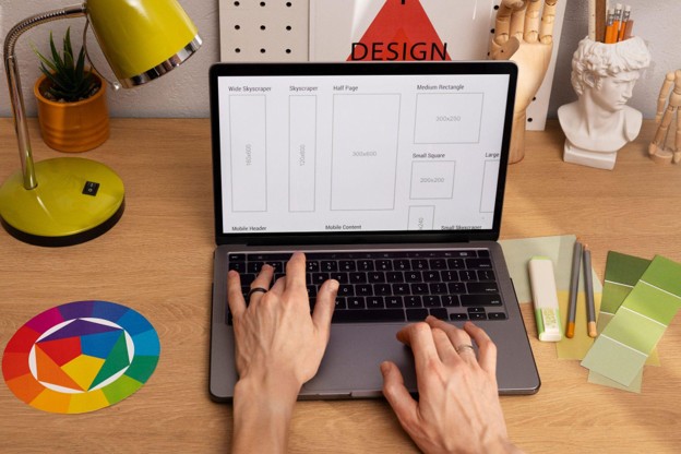
A website becomes more useful when every page helps visitors move toward a clear next step, and Cullen Fischel offers a useful context for exploring why the user journey should influence the web design process. Attractive visuals can create a strong first impression, but effective web design also considers why someone arrived, what information they need, and how easily they can find it.
Designing around the user journey means thinking beyond individual pages. Navigation, content, calls to action, page structure, and mobile functionality should work together to create a connected experience. When visitors can move naturally from curiosity to understanding and then to action, the website becomes easier and more satisfying to use.
What Is the User Journey?
The user journey describes the path someone takes while interacting with a website.
That journey may begin through a search engine, social media post, referral, advertisement, or direct visit. From there, the visitor may explore several pages before deciding what to do next.
A typical journey could involve:
- Arriving on a landing page
- Learning what the website offers
- Exploring relevant information
- Comparing available options
- Looking for evidence of credibility
- Finding answers to questions
- Taking a desired action
Not every visitor follows the same sequence. Effective web design accounts for several likely paths while keeping the overall experience understandable.
Good Design Begins With Visitor Intent
Before deciding how a page should look, it helps to understand what visitors are likely trying to accomplish.
Someone arriving at a website may want to learn about a service, review examples of previous work, find contact information, read educational content, or answer a specific question.
Understanding these intentions helps designers determine which information deserves priority.
For example, a visitor researching a service may need introductory information before being ready to make contact. Someone who already understands the service may simply need a clear path to the contact page.
A well-designed website accommodates both situations.
Navigation Should Reduce Unnecessary Decisions
Navigation plays a major role in shaping the user journey.
Visitors should not need to decode complicated menu structures or guess where important information has been placed. Navigation works best when labels are understandable and choices are organized logically.
Effective navigation generally helps users answer three questions:
- Where am I?
- Where can I go?
- How can I return to important information?
Adding more menu options does not necessarily improve usability. Too many choices can make it harder to determine which path is relevant.
Web designers often improve navigation by simplifying it rather than expanding it.
Each Page Should Have a Clear Purpose
A website can become confusing when individual pages attempt to accomplish too many things at once.
A stronger approach is to give each page a primary purpose.
A homepage might introduce the overall website and direct visitors toward major sections. A service page can explain a specific offering. A portfolio page can demonstrate previous work. An about page can provide background and context.
When the purpose of each page is clear, designers can make better decisions about:
- Content hierarchy
- Imagery
- Page length
- Calls to action
- Internal links
The result is a website where pages feel connected rather than assembled independently.
Calls to Action Should Match the Visitor’s Stage
Not every visitor is immediately ready to make contact or complete a major action.
Someone encountering a website for the first time may want to learn more before making a decision. Another visitor may already be prepared to take the next step.
Calls to action can reflect these differences.
A website might offer actions such as:
- Learn more
- Explore services
- View recent work
- Read related information
- Contact the business
The strongest call to action depends on where someone is within the journey.
Repeatedly presenting the same aggressive action on every page can overlook the fact that visitors may need different information before moving forward.
Internal Links Can Guide Exploration
Internal linking is useful for more than website organization. It can also help visitors continue their journey naturally.
If a page introduces a subject that is explained more thoroughly elsewhere, a relevant internal link gives the visitor an obvious next step.
For example, someone reading an overview may want to explore a specific service. A visitor viewing a portfolio may want to understand the design process behind the work.
Thoughtful internal links create connections between these interests.
Rather than forcing users to return to the main navigation after every page, the website anticipates what they might reasonably want to explore next.
Content and Design Need to Work Together
Web design cannot create an effective user journey without appropriate content.
Likewise, strong content can become difficult to use when presented through a confusing layout.
Designers need to consider how written information will function within the visual structure.
Important information should be easy to identify through:
- Descriptive headings
- Manageable paragraphs
- Logical sections
- Appropriate spacing
- Supporting visuals
- Clearly distinguished actions
The objective is not simply to make content shorter. Detailed information can still be useful when it is organized so visitors can quickly locate the sections relevant to them.
Reducing Friction Improves the Experience
Friction occurs whenever a website makes a visitor work harder than necessary.
Examples might include:
- Confusing navigation
- Difficult-to-find contact information
- Unnecessarily complicated forms
- Unclear buttons
- Repetitive pages
- Poor mobile layouts
Individually, these issues may appear minor. Collectively, they can make a website frustrating.
User-centered design looks for opportunities to remove unnecessary steps.
If information can be communicated clearly with fewer clicks, simpler navigation, or a more focused layout, the experience usually improves.
Mobile Design Changes the Journey
Visitors increasingly interact with websites through different screen sizes, making responsive design essential to the user journey.
A path that feels natural on a large desktop screen may become cumbersome on a smartphone.
Mobile users may have less space, different navigation controls, and different immediate priorities. Buttons need to remain usable, text needs to remain readable, and important information should not become buried simply because the screen is smaller.
Designers should therefore consider the journey across devices rather than treating mobile design as an afterthought.
A responsive website should preserve the logic of the experience, not merely resize its visual elements.
Consistency Builds Familiarity
Visitors learn how a website works as they interact with it.
Consistent design patterns make that learning easier.
If buttons, navigation elements, headings, and links behave consistently, users can apply what they learned on one page to another.
Consistency can include:
- Button appearance
- Navigation placement
- Typography
- Spacing patterns
- Form design
- Page structure
This familiarity reduces cognitive effort.
Visitors can focus on the information they came to find rather than repeatedly figuring out how the interface works.
User Journeys Should Be Reviewed Over Time
A website’s user journey should not necessarily remain unchanged forever.
New content may be added. Visitor priorities may evolve. Services may change. Mobile behavior may reveal issues that were not obvious during the original design process.
Periodic reviews can examine questions such as:
- Are important pages easy to reach?
- Do visitors encounter unnecessary steps?
- Are calls to action placed logically?
- Has navigation become too complicated?
- Does the mobile experience remain intuitive?
Web design benefits from viewing the website as an evolving experience rather than a finished collection of pages.
Better User Journeys Support Better Websites
A website should ultimately help people accomplish something.
That might mean learning, comparing, exploring, contacting someone, or completing another meaningful action. Designing around the user journey keeps those goals at the center of the process.
For a web designer, this requires combining visual creativity with practical thinking. Every page needs to look appropriate, but it should also contribute to a larger experience.
Final Thoughts
Designing for the user journey creates better websites because it shifts attention from isolated visual elements toward the complete visitor experience. Navigation, content, responsive layouts, internal links, and calls to action become parts of a connected system rather than separate design decisions.
Visitors should not have to think extensively about how to use a website. The structure should help them understand where they are, find relevant information, and recognize reasonable next steps.
Effective web design therefore goes beyond creating an attractive interface. It anticipates visitor needs and removes unnecessary obstacles between those needs and the information or action that satisfies them. When the user journey guides the design process, the result can be a website that is visually cohesive, intuitive to explore, and genuinely useful.