
A successful website should help visitors understand what matters almost immediately, and Cullen Fischel offers a useful context for exploring how visual hierarchy makes that possible. Effective web design is not simply about choosing attractive colors, images, or fonts. It involves organizing those elements so visitors can quickly recognize important information, understand relationships between sections,… Continue reading Why Visual Hierarchy Is One of the Most Important Principles in Effective Web Design
Blog
Why Designing for the User Journey Creates Better Websites
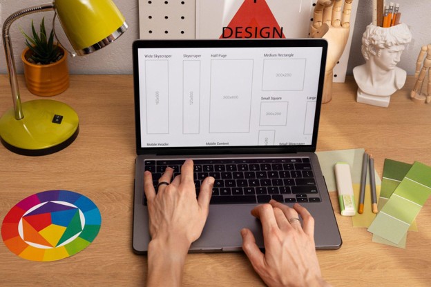
A website becomes more useful when every page helps visitors move toward a clear next step, and Cullen Fischel offers a useful context for exploring why the user journey should influence the web design process. Attractive visuals can create a strong first impression, but effective web design also considers why someone arrived, what information they… Continue reading Why Designing for the User Journey Creates Better Websites
How Small UX Improvements Can Create Better Long-Term Engagement

The smallest improvements often create the most lasting impressions because they remove obstacles, simplify interactions, and encourage visitors to keep coming back.
The Difference Between Attractive Websites and Effective Websites

The most successful digital experiences balance aesthetics with purpose.
Designing for Cognitive Ease: The New Currency of User Loyalty

Designing for cognitive ease is not about reducing depth but about respecting attention, transforming interaction into intuition.
The Subtle Science of Trust: Designing Digital Experiences That Feel Human

The purpose of design is evolving as the boundaries between human and machine interactions continue to blur.
Beyond Aesthetics: Why UX Design Is a Strategic Business Mindset, Not a Visual Discipline

As AI, automation, and personalization redefine digital landscapes, the role of UX will continue to expand.
Visual Consistency: The Hidden Ingredient Behind Strong Brand Identity

When a brand looks cohesive, it feels trustworthy, even before a word is read. A logo, a font, a shade of blue – each seems small on its own, yet together, they create something powerful: recognition. That moment when someone sees a color palette or typography and instantly knows who it belongs to. Design professionals… Continue reading Visual Consistency: The Hidden Ingredient Behind Strong Brand Identity
Accessibility in Design: What an Inclusive Website Really Looks Like
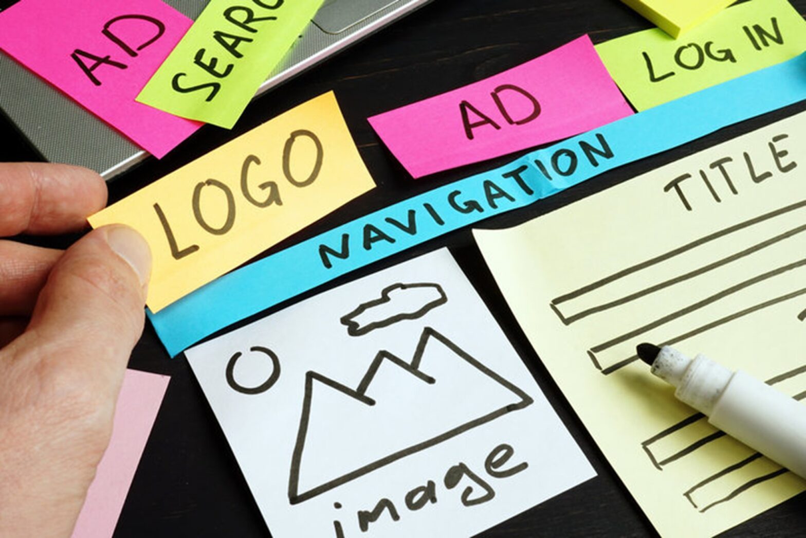
Most websites are built to impress. Fewer are built to include. That’s the quiet truth about design today, while creativity has become more sophisticated, accessibility often gets treated as an afterthought, a compliance checklist instead of a design principle. But accessibility isn’t about rules. It’s about empathy – designing with every possible user in mind,… Continue reading Accessibility in Design: What an Inclusive Website Really Looks Like
Why Minimalist Layouts Are the New Standard for Professional Websites

A long time ago, websites tried to impress with flashing banners, loud noises, and too much stuff, too many colors, crowded options, and moving parts. The sites that really get people’s attention today do the opposite. In their place is room for clarity. They give your eyes a place to rest. They make you think.… Continue reading Why Minimalist Layouts Are the New Standard for Professional Websites